
After years in the business, I've had plenty of new clients come to me because of printing bloopers that are usually the result of pre-press issues. With a little more attention these could have been easily avoided.
Here are some easy tips to help you when it comes to avoiding these printing disasters:
Send a sample of the color you want
Sometimes proofs go out and it doesn't match the color the client thought it would. How did this happen? Printing in CMYK or RBG can result in colors that look different from what's on your computer screen. Every computer screen has tons of variation - what looks like blue on your computer may look more green on mine.
There's an easy fix to this: Send us a sample of the color you want and we'll find a match for you. Our tools can find a close match and get you the color you want, not one that just looks good on screen.
Exact colors can be found using the Pantone Matching System (PMS). For things like logos and branding materials, the slightly additional cost can be worth it when it comes to matching your branding across the board. But there's also the option to convert the PMS into CMYK - it won't be the exact color but it will be close.
Getting a proof is also a great way to make sure the color is correct prior to going to print.
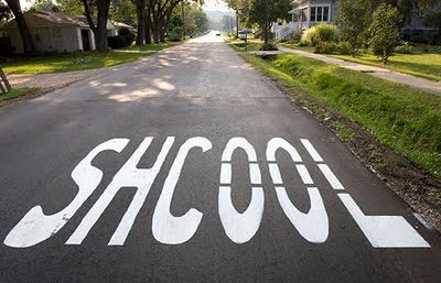
Spellcheck
We make sure to check all of our files that come in - that's part of the personal touch with PSI. But to make sure to avoid having 5,000 flyers with "school speliing context" on them, it's always a good idea to have a second and even a third pair of eyes proof-read anything that's going to print.
Check font and line weights
Be aware of how your font looks in bigger sizes. Some fonts can tend to almost disappear into the background if the weight isn't thick enough. On the flip side, fonts with heavy weights can be difficult to read in smaller sizes.
Always use 300ppi and quality images
PPI = pixels per inch. The more pixels, the more clear the design and resulting print job will be. If you're designing something for the web, 72ppi is great. But when a file comes in at that resolution to be printed, I know almost right away it won't print very clearly. 300ppi is the go-to - any less and you risk a slightly blurry print job.
There are some great and relatively inexpensive sites on there for stock photos that will give you the resolution you need, with dollarphotoclub.com being one of them. The clarity of a quality image and resulting crisp printing is a worthy $2-5 investment.
Looking for someone else to handle the design work? PSI is here to help with that as well as your printing needs. Get in touch anytime and we can talk about some ideas.
Happy designing!
- Denise Hayes
At PSI, we'll always check your pre-press files. Contact us today to get started!